Duplication Centre

CD, DVD, Blu-ray duplication

01702 530 354

24 Hour Turnaround

Posts Tagged ‘CD artwork’

We Check Prices: 17th April 2023

Monday, April 17th, 2023

Every few months we check our competition to make sure we offer the lowest prices for CD/DVD/Blu Ray Duplication.

We’ve just done it for this quarter with a guarantee that we will match or be better already, to any other like for like quote.

We also ensure our quality is exceptional by investing in new technology.
This, at the very time our competitors are looking to cut corners.
Just installed is our new Digital Press, which means your artwork will look incredible.

We use only professional Grade A cases adn all our artwork is printed on FSC Certified and Sustainable card & paper .


Call us for a quote or a chat about your project.

01702 530354


Proofing Your Artwork: 30th March 2022

Wednesday, March 30th, 2022

We offer both soft ( electronic) and hard copy proofs to you, free of charge.

Some customers just want to visualise or in the case of a hard copy, see the quality of their order and how it will actually look when printed.

So for example this customer wanted to see the colour match of his disc to the digipak:


CD and printed art on card for proofing colour match

It can be the case that printed parts will not exactly match the colour of the same colour upload, when its printed on a disc…just the fact that they are printed on different mediums can affect the tone of the colour sometimes.

In the case of a hard copy proof we print 2 copies and hold 1 here as a control and post the other to you by Royal Mail.

You then have the option to approve straight away if you are happy with the print or to alter it by uploading new artwork to us.

We will always work with you to get the best result possible for your order.


Not everyone wants or needs this so if you do, just need to mention that you would like this in the notes (which is a free field text section) as you check out.


We have all sorts of other advice in our artwork section here:

https://www.duplicationcentre.co.uk/artwork.html

Or you can call us on 01702 530354 and we will be happy to help you.

Incredible Artwork Design: 31st October 2019

Thursday, October 31st, 2019

Highlighting some amazing customer design.

This single card wallet and cd onbody printing are so seamless its hard to see where each start and finish.

pastal colour design of cd art slipping in to a crd wallet with the exact same design rain droplet on a leaf


Go to our free online artwork creation tool and the templates that are easy to download to help you with you with your design.

https://www.duplicationcentre.co.uk/artwork.html

Plan Ahead: 23rd October 2019

Wednesday, October 23rd, 2019

Hi Everyone,

Now is the time to start planning for your Christmas Sales of DVDs and CDs…it’s a great time to raise money for your bands funds, for Schools or Charity.

Give us a call and we can chat you through timings and ideas for the best selling packages for you.


We do however work right up to the week before Christmas and are always here to help with a rush job if we can.

School Christmas DVDs over 5 years of productions with childrens artwork covers

SCHOOL PRODUCTIONS RAISING MUCH NEEDED CASH!

CD Insert and Cover Layout Design Tips

Monday, January 4th, 2010

It's tricky to create a good CD design - so here are some tips to help you!

The design of your CD artwork will have a really massive effect on who buys it and what your consumers think of it. Way before they listen to your CD, they will probably see the cover on a shop shelf. A lot depends on them taking an initial liking to this image, and also to the insert or booklet and back cover. This is why it is so important to put lots of effort into making your CD artwork look appealing and attractive – and not just to any user, but to your selected market! So this article intends to gives some helpful tips and advice on how to make your CD look super!

To start, it helps to know what size your inserts need to be:

– The insert for the front is 4.75”x4.75”
– If you want to make a foldout, simply add an extra 4.75” of length onto the initial dimensions for the insert until you have the desired number of pages
– If you are making a booklet, it should be 9.5”x4.75” so that it can be folded in half. This can be repeated for as many pages as are needed in the booklet
– The back insert is 5.906” with 0.25” on either side for each spine x 4.625”

These are the standard sizes for a CD Jewel case however I would advise leaving a 0.25” ‘bleed’ around everything to make sure that you don’t get any nasty unintentional borders – these can look really unprofessional! A ‘bleed’ is a gap where the image overlaps outside the print area and it serves to prevent white patches around the edge of an image. Similarly, don’t forget to leave a 0.25” gap inside the image too, called a ‘safety’, making an area called the ‘live’ image, where you can be certain that no important bits will get chopped off!

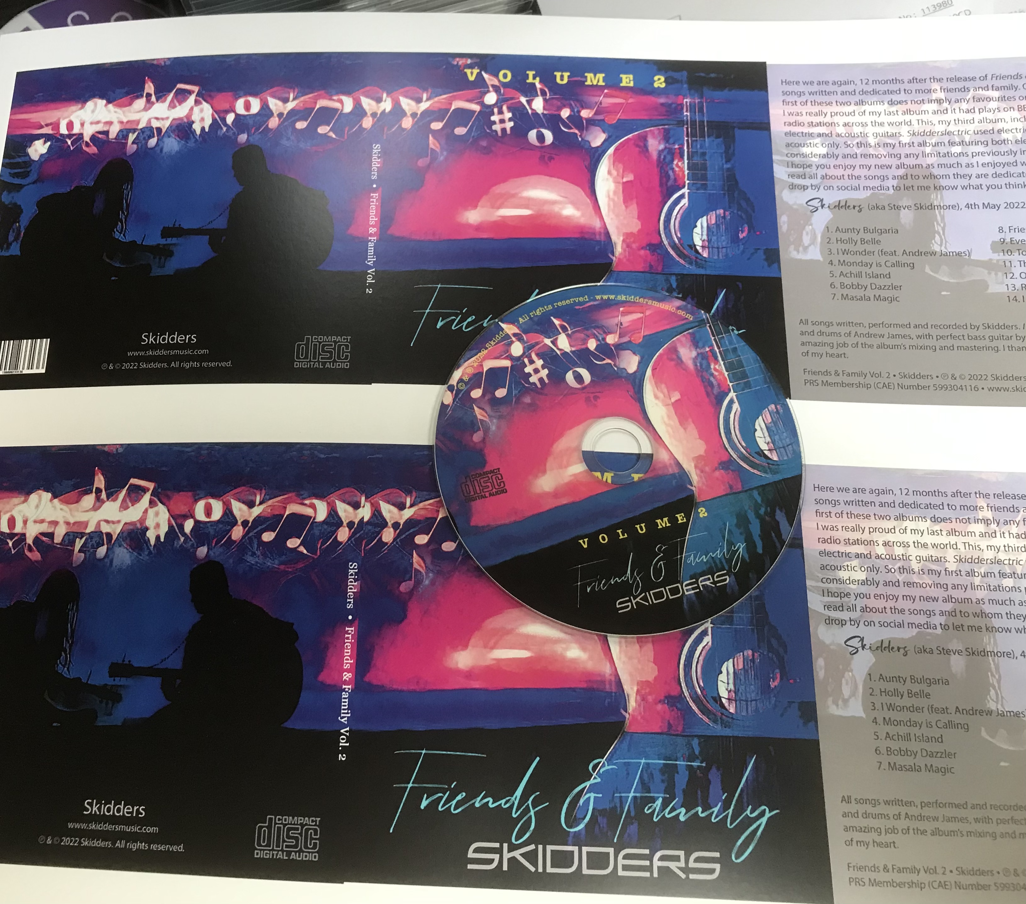
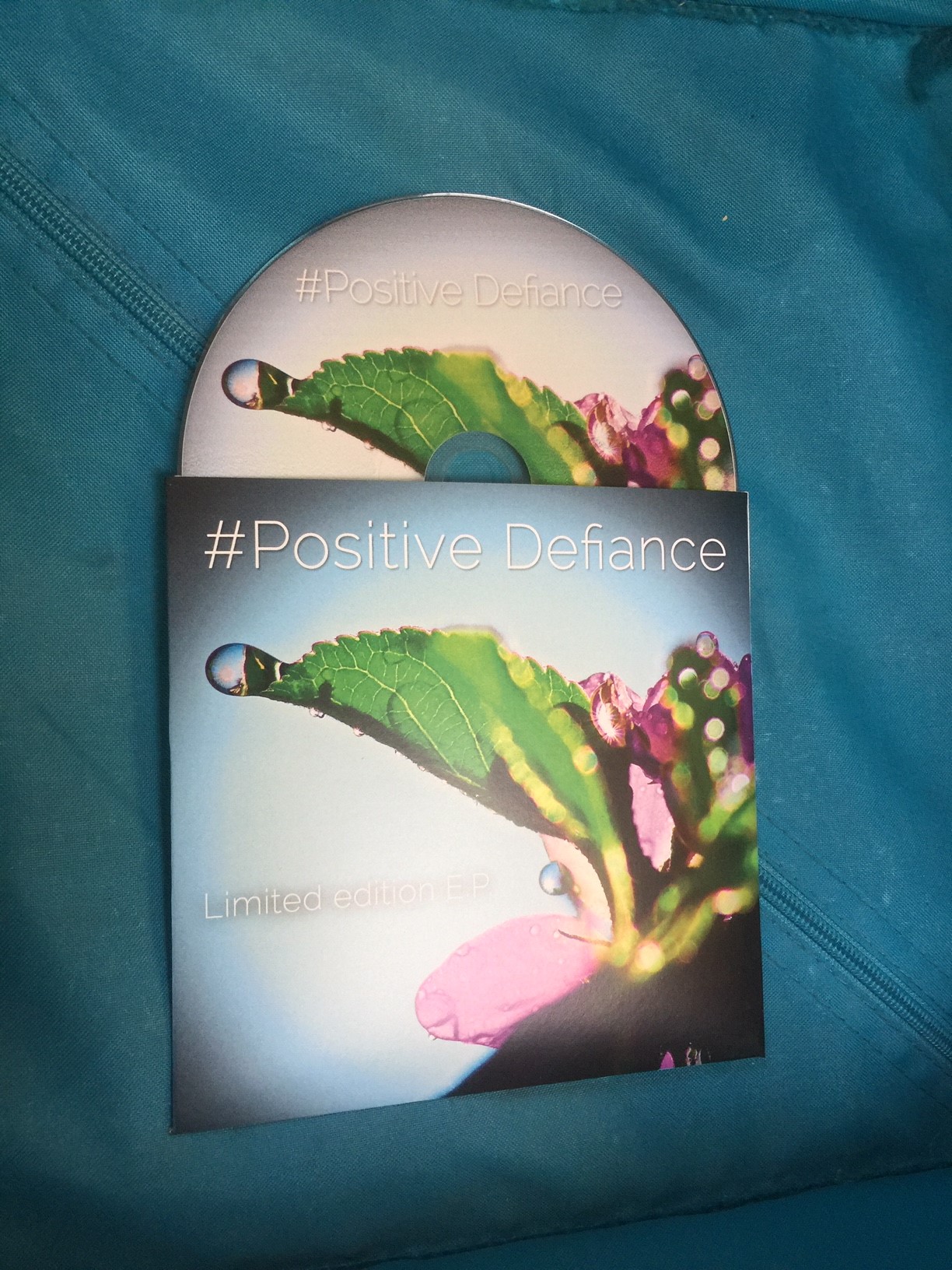
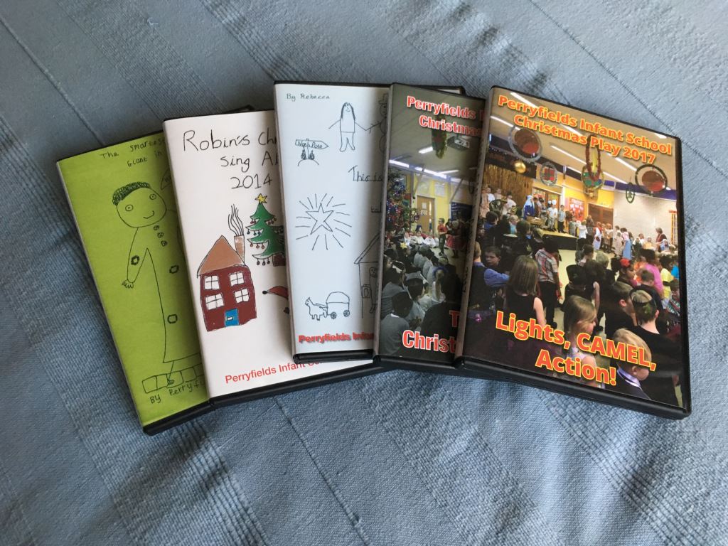
As for what you put in the artwork, that is quite up to you, but it is a good idea to have important information accessible from the outside, i.e. on the front or back covers. For example, if you are making a music CD, it is a good idea to include the artist, album or single title, song names and record label in an easily visible place. But at the same time, don’t overload the cover with information which could be off-putting to many users. Sometimes simple is good! If you are making a booklet, you might want to put in some interesting information like an interview with the artist, lyrics or acknowledgments. Conversely, you could just have lots of really lovely pictures – it depends a lot on what you want the mood of the CD to be.

As for the imagery itself, try and make it as personal as you can, for instance if you’re making a mix CD for a friend perhaps include images of the two of you together! Obviously, if you are aiming at a wider audience try and define what would appeal to your market. For example, heavy metal music usually has very heavy, gothic artwork involving lots of blood, skulls and demons, while classical music tends to have calming scenery or renaissance paintings on the cover.

The same rules apply for choosing a font. For a more serious audience, try and select a serious font, for instance ‘Garmond’. Try not to pick anything that is too hard to read or very over-used – these will both put people picking up your product whether because they can’t understand it or whether because they dislike the cliche implied!

To pick up the mood of your CD, especially if it’s musical, it can be really beneficial to listen to it while you are working on the artwork: Professional graphic designers do it all the time to get their creative juices flowing! Also, try creating a few different images before you settle on one as sometimes the first idea you have is not necessarily the best and look at other artwork to see what else is being done for inspiration. If you’re working on a computer, it is also worthwhile to zoom right out sometimes and take a look at the cover as a whole: This will give you a much better idea of what it will look like once it’s printed up!

Be especially careful when designing your spine – it may look like a small thing but it is very easy to mess up if you don’t leave the proper bleeds either side of it! I would suggest at least two millimetres to compensate for any inaccuracy during the guillotining process, ensuring the writing doesn’t get cut in half or left off altogether! It’s usually a good idea to fit as much information as you can on here. With a music CD it’s normally the band name, record label and album or single title.

It’s also quite important to keep your packaging in mind: The artwork will have to fit into it. Consider whether you wish to make a booklet, fold-out, single sleeve or whether you want to do something extra special. The band Tool recently brought out a very individual album with stereoscopic viewing lenses inside the booklet which made all the images appear in 3D! Their fans loved it and it got them a lot of publicity! Remember though, when brainstorming these awesome ideas, to always consider the cost, too. Sometimes what seems like a great plan is not practically the best thing to do.

It’s also worth bearing in mind – and this is particularly appropriate for music CDs – that in this technological age, many CDs get copied to computer CD libraries where the CD artwork can be viewed when the song is played. It is worth remembering that any special colours, or ‘spot’ colours, which cannot be made with the standard computer colour displays will not show up! These include fluorescent and metallic colours. Though these look very nice on the shelf, you may want to make a different set of artwork that is computer-friendly, too.

A particularly useful website for helping to design and create original and attractive CD covers, inserts and body-prints is offered here for free! You can upload your own images, add text and know for sure that your layout is exactly what is needed!

I hope this helps get your ideas-hat on and gives some practical advice, too! Good luck with all your CD artwork designing! Remember to keep your intended user in mind and never stray far from the CD content and you’ll be well on your way to creating some great CD artwork!

Differences between disc printing methods – which one is right for you?

Monday, January 4th, 2010

It can be difficult to decide which CD printing method you want to use

It is very important to have labels on your CDs: This is not only so other people know which way up it is supposed to go into the machine, but also for a beautiful and professional-looking product. But the problem is, there are lots of different ways of disc printing so deciding which one is most suitable to your needs can be tricky! This article is aimed at helping you to figure out which one you want to use!

To start, there are four main techniques for printing CD labels: Lithographic, or offset, printing; thermal transfer printing; silkscreen printing; and inkjet printing. Each one has it own pros and cons.

Lithographic CD printing, or offset printing, involves putting your CD artwork onto a processing plate either through simply printing it from a computer or using photographic negatives and a chemical treatment. The plate is then ‘offset’, or imposed, onto a rubber blanket cylinder which applies it to the surface of the CD or DVD. This process looks incredibly good, and allows for high-quality photographic images and small text to be printed onto your CD. However disc printing in this way is only avaliable if you are replicating rather than duplicating discs as it is part of a whole manufacturing process. It can take up to ten days for the entire process to complete, thus is much less speedy than other printing methods. It is, however, a very good printing option if you need more than 1,000 discs to be made as large batches of discs are usually replicated anyway to save money. But, even taking this into account, Lithographic printing is not the cheapest option by any means.

A Table Showing the Different Methods for Printing CD Labels

When it comes to thermal transfer disc printing, each colour is placed separately onto a transfer ribbon which is then applied beneath a heated print-head. It seals the disc so that the label is waterproof and smudge free. Because the

images are taken directly from a computer, the process is very fast. It is cost-effective in small runs and also looks very good – the print quality is even better than with lithograph disc printing! (This is not to be confused with thermal printing which uses basically the same technique but can use only one colour and is slightly less precise in finish – though it is even faster and cheaper!) Both thermal and thermal transfer printing do not allow you to print right up to the edge of the disc and thermal transfer printing will quite often have to have a white base to print the other colours on top of.

Next, silkscreen printing, or simply ‘screen’ printing, allows disc printing by passing ink through a monofiliment screen. Each colour is put on separately, a different film acting as a stencil over the screen each time. This technique, while by far the cheapest for large runs of disc printing, can leave a grainy effect around colour gradients and text. Nevertheless it is perfectly acceptable for simple designs which use only a few colours. Be warned that the more colours you use with this technique, the less the quality of the image will be!

Lastly, using inkjet printing you can achieve a very high quality finish. This process involves simply printing straight onto a specially prepared disc, then covering it with a UV-resistant laquer so the image will not fade or get scratched. This is a very good method of printing, however it does tend to be pricier for large runs of disc printing, as the price is fixed and does not drop the larger the order becomes. In this way, it can be more economical to is silkscreen or lithographic printing methods.

I hope that this article has helped you make up your mind which printing method is right for your needs and good luck with your disc printing! Remember, if you can stretch the budget, it’s better to have a good-looking disc as it will attract more attention and consumers will like it better!

Duplication Centre Resource Centre is proudly powered by WordPress | Entries (RSS) | Comments (RSS) | 29 queries. 0.036 seconds.